We believe that anyone can build a WordPress membership website. Yes, anyone.
There are plenty of good reasons to DIY your membership site (and good reasons not to), but for those who have a basic knowledge of WordPress, you can definitely do it.
The key to success is ensuring that your website is both functional and beautiful.
Member sites must absolutely work like member sites (we’ll get to that in a bit), but they also need to look good, too.
Design plays an important role in how potential members perceive you. Here’s what to know about making the best looking DIY WordPress membership site out there.
Why Design Matters for Membership Sites
Whether you consciously realize it or not, design impacts a lot about the user experience (UX).
Statistics show that the majority of Internet users prefer to browse a pretty site than an “ugly” one, even if there’s nothing there of real substance.

It’s not too difficult to make something look good.
The foundation of good website design can be boiled down to a few basic “checklist” items:
- Responsive design — It should look and act the same on every screen (mobile, desktop, etc.)
- Call-to-action (CTA) buttons — There should be actionable ways for visitors to “buy-in”
- Readable fonts — It has to be readable!
- High-quality images — Images should be clear and enhance the emotional appeal of your message
- Easy navigation — Users should know where to go to find what they need
- Clear branding — People should be able to tell who you are and what you do
- Fast loading speeds — Your site needs to load in a reasonable amount of time
A decent WordPress theme and access to some good tutorials can get you to that point.
The real trick is to make sure your site looks good while still providing a genuine experience for members. Membership sites are a lot different than traditional sites in this area.
Members will spend more time interacting with your site than the average visitor.
In addition to worrying about what images to use on your homepage or how to set up your site in a way that generates leads, you also have to worry about things like logins and member areas.
This makes it doubly important to ensure it’s an aesthetically pleasing experience.
Here are a few best practices to follow to ensure it’s a good experience for members in both function and design.
1. Use Common Design Patterns as a Foundation
If you’ve spent any time on the Internet you’ve probably noticed that the majority of sites all look the same.
It’s just different iterations of one basic formula: Logo in the upper left-hand corner, navigation bar following the logo, CTA following the nav bar, headline (and sometimes additional text) underneath, followed by a big CTA button.
Here’s Mailchimp’s homepage:

Here’s Birchbox’s homepage:

Here’s YogaWorks’ homepage:

Why are they all so alike?
Simply put, designers have figured out what works over the years and developed templates that quickly and easily give users the same experience.
Psychologically speaking, people don’t love variety as much as they think they do. They want consistency.
Having similar websites lets people know what they can expect, where they can find the most information quickly. It’s good user experience (UX).
When it comes to design best practices, don’t overthink it. Go with what works.
Basic, user-friendly design gives visitors a common experience while also giving you freedom in the areas that count (e.g. do you want a video behind your banner or just an image?).
You can add any and all custom elements over a common layout without confusing the user.
2. Make Every Page Sales-Worthy
Traditional design advice would tell you to focus on making your homepage look as amazing as possible, and many designers (pro and novice alike) do end up spending the bulk of their time on the homepage.
The trouble with this is that the homepage isn’t the only place where you get leads. In fact, it might not be your highest traffic-producing page.
Unless you have one of those single-page scrolling sites, more people will spend time on your pricing page or your services page than they will on your homepage.
Take a look at Chris Ducker’s (Youpreneur) homepage:

It’s a basic layout, but one that’s also designed to sell. Now look at his About page:

There’s another strong CTA at the bottom, which is also designed to sell. His blog also has a CTA for becoming a Youpreneur member:

Even his contact page is designed to sell.

Every page is designed with a purpose. It’s not there to just exist.
This is how you want to think when it comes to building a cohesive (and converting) design throughout your site.
Use as many opportunities as you can to move people throughout the funnel, because they might not ever come to your homepage to see your CTA.
Use. Every. Page.
3. Explain How Your Membership Works Up Front
Studies show that 86% of visitors will want to see information about your products or services in the first few seconds after they land on your site.
Unlike traditional sites, not all memberships work the same way.
There are different pricing strategies, different benefits, and even different online experiences — let’s be honest that some sites have member areas that are more robust than others.
Having the details about how your membership works front and center can make all the difference when it comes to conversions.
Dollar Shave Club has their “how it works” section as a part of their main navigation and linked to a few of their CTAs throughout the site.


Same for Reflexion Yoga (they also include it as a secondary CTA under their headline).


Angle of Attack uses a “Start Here” link instead of a “How It Works” links, but the basic principle is still the same.


Each example applies the same principle: Give users a clear-cut way of understanding what it is that you do and how they can participate.
Don’t make them dig through your site to find out how your membership works.
4. Showcase Your Pricing Strategy Clearly (But Creatively)
Your pricing page will be one of the biggest (if not the biggest) selling point for non-members looking to sign-up.
Because there are so many different ways you can price out your membership, you want to make your pricing strategy as clear as possible.
The average pricing page looks something like this (if you have a tiered membership, for example):

But you’re certainly not stuck with that as your only option. Consider your audience and the overall “tone” and feel of your website.
Could you do something more creative, like MailChimp used to do?

Or do you want a more streamlined version like they have now?

How about something like Geeks Life?

They list out each membership level as a separate box, starting with their free membership working down to their most expensive level.

The most important thing to remember is to clearly indicate what benefits users are getting for their money.
Aside from that, the sky’s the limit in terms of displaying your pricing creatively.
5. Focus on Good Sign-In UX
A major differentiator between traditional WordPress sites and WordPress membership sites is the sign-in factor.
Users need to login to a member area of your site. Afterward, they’re typically directed to a members-only dashboard or separate section of your site with different content available.
But there are two things you need to consider when designing for the sign-in experience:
- The sign-in CTA needs to be plainly visible from every page
- It needs to be quick and easy for users to input their login information
Here’s an example of a basic sign-in CTA from Paleo Plan:

The CTA button is located in the main navigation in the upper right-hand corner, as well as the footer. This is accessible from every page of the site.
Once you click the CTA, you’re led to a separate login page.

Even though the page itself isn’t much to look at, it’s still branded.
If you have your member sign-in page load separately, make sure that it’s branded with your information. Yes, members should know that they’re signing into your site already. But branding still helps.
You should also make sure it’s clear that your sign-in CTA is for members to login, not for new members to sign-up. If you have both CTAs on one page, like your homepage, be sure there’s a difference.
Paleo Plan does a good job of this on their homepage:

You also have the option of including a non-member CTA in your login area, like Copyblogger does.

Just make sure all sign-in CTA buttons are noticeable.
Again, you don’t want members wandering around your site wondering where to go.
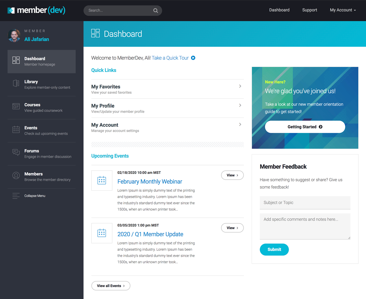
6. Design Your Member Areas for Ease of Use
The member area after sign-in is just as important as the rest of your site, if not more so.
Depending on the type of content or information you have in your member area, it will look different.
If your membership area is just to access account information or set preferences for your product or service, for example, it’s fine for it to look more technical.
Here’s an example of the Coursera member area:

You can find details about registered courses, updates your settings and browse for new courses, but there’s no specific content displayed in the member area (unless you’re already active in a course or two).
Ipsy’s member area is a little different, as it displays links to account details, links to specific product pages (their “Glam Bag”) as well as additional content (blogs, events, etc.).

In the Ipsy member area images, videos, and other learning resources are the main focus.

Whereas Copyblogger is entirely content focused, with minimal emphasis on account settings.

Each member areas plays to the specific needs of its members. If your membership is primarily content driven, having a membership area that skips the technicalities might be better.
If members will need details about your products or their account, then you might save the content for a different area of your site.
Or, like Ipsy, you can do both.
7. Use Plugins to Fill in the UX Gaps
If you’re panicking about how you will add all of these design elements and features to your site as a DIYer, don’t worry… there are WordPress membership plugins for that.
We highly recommend MemberMouse as a starting point, especially if you’re DIYing.

MemberMouse lets you create both membership levels and bundles as well as membership areas (with different types of sign-in CTAs) which are customizable to your needs.
They also have templates available to make your designs bespoke to your brand, or you can use it alongside another membership-friendly WordPress theme.
You can also create test accounts to experience your site the way members do, which makes it great for designers who want to make sure members are having the best UX possible.
But even if you don’t use MemberMouse, consider adding more functionality and UX with plugins.
Plugins make your life easier and your website better.
Final Thoughts
There are a lot of components to good design, so if you’re not sure where to start, brush up on your WordPress design knowledge first (here’s a good place to start).
Just follow some design best practices and you should be fine. And use templates where needed.
When it comes to member-specific design elements, like member logins and member areas, find a decent plugin to take care of the heavy load for you.
If you get stuck, don’t feel like you have to do it all on your own.
Feel free to let someone else take the designing off your hands so you can focus on making members happy.