Great products often fall victim to badly designed websites.
It doesn’t matter how much time you’ve spent developing your product or subscription service, how many investors you have or bootstrapped your company is… ultimately, a poorly designed site will mean fewer sales.
According to Adobe, the masters of Design, two-thirds of people would rather read something beautifully designed than something plain.
While many sites nowadays tend to be cookie-cutter in their aesthetic — which isn’t a bad thing; they’re optimized for the modern Internet user — there are some that just stand out from the crowd.
If you’re trying to design your own WordPress website and need a little inspiration from the pros, look no further. Here are a few of the best site designs from other subscription and membership businesses out there.
Best of Homepage Design
Before social media and paid ads, the homepage was your brand’s first impression. That’s not always the case today, as many users will end up on other landing pages, customer review pages, or even blogs before they see your homepage.
But wherever they land, they’ll probably end up back to your homepage eventually. That’s why it’s doubly important that your homepage make more than a good impression.
Your homepage should explain who you are, what you mean to the customer, and where they should go next.
The following brands have information and impressions in spades.
Buffer
What is Buffer? If you’re not already familiar with the brand, you’ll know what they do as soon as you land on their homepage.
They help you manage your social media accounts from one place.

The design of their site isn’t so-cool-your-head-will-explode. In fact, it looks a lot like other sites you’ve seen a hundred times. So why does it make the list?
For starters, it’s just easy to understand. The value proposition is clear, the images enhance the explanation of their service, the subheader gives you all the information you want, the colors are crisp and bright and clean, and they have explainer videos.
It’s just… a nice website to look at and use.
Everything you need to know about Buffer is on one page — the homepage. Although most marketers will tell you never to send a paid ad to your homepage, this is a case where exceptions can be made.
Salesforce
Salesforce has a lot of things going for it in the design department. It’s animated-style look and feel give it a unique vibe, particularly for a SaaS subscription business.

There’s something whimsical about their branding that makes you feel like you can trust them. It shouldn’t work, but it does. That’s not the only reason they’re on this list, though.
One thing Salesforce does well is give you the information you need right away — how much is this going to cost?
For a SaaS business, that’s exactly the right move. Many SaaS subscription businesses hide their prices near the bottom of the page or make it hard for you to find them. Some sites have their pricing page buried in their footer.
SaaS customers are always price-conscious. Salesforce will tell you right away: It’s $25/month. Here’s how to get your free trial.
That’s honestly brilliant design.
Hello Chef!
Hello Chef! is a meal-delivery subscription kit that plays off both the above examples. Like Buffer, it gives you everything you need in the first header and subheader: delicious food, delivered weekly.

Like Salesforce, there’s a bright and colorful feel to the design, but they also do something smart by playing to their customer base. Under the bright red CTA button (designers, take note), there’s a list of answers that customers already are asking: Will this fit my diet?
Hello Chef! has a deep understanding of their core audience, and it shows up in the way their homepage is designed.
You don’t need a “fancy” design to answer customer questions and create a strong CTA. You just need to be smart with presenting the information you have.
Bonus: Planet Fitness
This one is a bonus. Planet Fitness has a nicely designed site in general, but the real reason it’s on this list is because of this promotional header:

Within the first five seconds of landing on this homepage, you already know five things:
- There’s a promotion going on
- There’s a time limit on it, it’s urgent
- It’s cheap (only $1 down!)
- But there’s no pressure to commit (smart — because there is pressure to get the deal)
- There are locations near you (presumably), so you can use this deal conveniently
This hits all the right design notes. It’s also highlighted in a bold yellow, which is always an attention-grabber. If you have a special promotion like this, follow Planet Fitness’ lead when designing your homepage.
The Designer’s Takeaway
Hopefully, you’ve noticed the theme here. Design your homepage in a way that automatically answers customer questions and explains who you are, what you’re doing, and why you matter.
Best of About Page Design
Will every site visitor see your About Us page? Probably not. But the ones that are truly interested in your brand will.
Think about this in context of your customers and their respective generations. Studies show that brand loyalty is a big deal for almost everyone, but Gen Y — the soon-to-be largest consumer base out there — aren’t loyal without a cause.
Brands that are more holistic in their approach to marketing tend to fare better with younger customers. That’s why the following brands are earning recognition.
These brands go above and beyond in proving they exist for more than just sales.
Zendesk
Zendesk has a visually gorgeous site. Another trend you’ll notice on this list is that many sites have clean, bold visuals. That’s important to note. But what Zendesk does with their visuals is truly inspiring.
They highlight people. Because, as they say on their About page, they’re “people people.”

They first and foremost highlight their company culture and vision (a commitment to diversity and inclusion), but it’s peppered in with important stats about the company’s impact as well as a healthy dose of humor.

They don’t really talk about their product as much as they talk about their impact. And that’s why they’re here.
CopyBlogger
CopyBlogger does a lot of things well, but the one thing that tops the list is their commitment to consistency. Every single page you land on feels like a Copyblogger page.
Here’s their About page:

Here’s a blog page:

Everything about their design screams “This is CopyBlogger!” That’s an automatic point in their favor.
But what stands out about their About page is the level of storytelling (which is exactly what you would expect from a copywriting brand).

They explain how they came to be the “bible of content marketing” and what it is that makes them unique. And the best part is that they don’t have a fancy design gimmick to draw you in. There’s one photo and then a handful of paragraphs.
It goes to show once again that “fancy” design doesn’t mean effective design.
They know their audience. They know their aesthetic. And they stick to it.
The Sill
The Sill sells plants. But it sells plants in a way that makes those of us without green thumbs want to buy plants. You can even subscribe to receive plants from them as a regular member! It’s a neat idea with a great slogan. But what about the design?

The site combines a little of the above examples into sheer perfection. It’s clean, with bold pops of color. It’s people-focused, like Zendesk, but simplistic in its storytelling. Their About page is a treat for the eyes with a heavy emphasis on emotional connection. Check out their mission statement:

Storytelling is the new art form.
Brands that can capture who they are in a really visually vibrant way will catch the attention of any shopper.
The Designer’s Takeaway
Get comfortable with storytelling. Design is not all about which images or fonts you use, but also about the message those images and fonts communicate. Consumers today want more than to be sold on a product, they want brands they can invest in. Focus on the “Why” in your design, too, not just the “What.”
Best of Product Page Design
All that being said, you’re still here to sell products. So your product pages need to be equally (or more) compelling as your other landing pages.
Subscription and membership sites often have a disadvantage in this regard compared to traditional ecommerce sites. You’re not just selling a product once, you’re selling it every month, year after year.
Often, it’s more about building a community around your product than it is selling the product itself. To that end, these sites really seem to have it all figured out.
UDAYA
UDAYA offers subscriptions to virtual health and fitness classes. It’s not one product, so it could have been tricky to figure out how to brand each and every page. The way they handle product page design is a masterclass in organization.
If you land on their “Classes” page, you will see a list of available classes as well as a comprehensive filter to find exactly what you’re looking for.

Need a beginner’s level yoga class for 30 minutes with meditative music? Just set your filters.
It’s a completely customizable product exploration page. You can also watch videos of each type of activity so you can see exactly what you’re getting before you buy in.

The whole experience is tailored to the customer, whoever they may be. Amazon does this with their “recommended products” and algorithm-based results, but it’s rarer to see an approach like this with a subscription product.
This one hits all the right design notes.
Ritual
Ritual is a monthly subscription-based multivitamin designed specifically for women. Consumers today are more conscientious about what they buy, especially when it comes to health and wellness. People want to know what they’re putting in their bodies.
Ritual’s product page gives them all the answers, and then some.

Not only do you get a list view of every ingredient with a high-quality image, you know where it was sourced from (Boron comes from Illinois, Vitamin B12 comes from Connecticut). You can even use a “Map View” to put it all into perspective.

The page also links to several case studies and research articles about the benefits of each ingredient, as well as some explainer content for how they chose each ingredient and why.
It’s over-explaining, but that’s exactly what you want from a product like this. It’s transparency in action.
If you’re going to put something in your body every day for years on end, you want to know what it’s doing to you. Depending on your product, you might not have to explain everything in exacting details the way Ritual does. Just remember that today’s consumers absorb knowledge.
It couldn’t hurt to include more information on your product pages.
Dollar Shave Club
Dollar Shave Club is excellent at branding and marketing. After Amazon Subscribe & Save, they’re the top-selling subscription brand. They know what works.
Their product page design is something that any membership or subscription site can follow, and many sites do use this template.

It starts with a bold image of their product, with a strong description and a link to “shop” their sets. There’s nothing extraordinarily clever about it, but it’s incredibly effective.
It’s here because it should be the standard of design for similar brands. It’s well branded, well organized, well thought-through, and, most importantly, it works.
The Designer’s Takeaway
Effective product pages for subscription businesses have more than just pictures and a bullet list. Think of it like this: You’re selling a multitude of products (months or years worth) at one time, so you need to sell hard. That means more information, more transparency, and more organization.
Best of Pricing Page Design
For membership and subscription businesses, having the right pricing model is key (we have some pricing strategies for you here). How you showcase your prices is important. That’s where these brands stand out.
MailChimp
MailChimp is another site that could fall into many of these categories. They’re great at branding. But their pricing page is a combination of all the best-of design practices on this list. It has bold storytelling and eye-popping visuals.

It’s well-organized and well-explained.

And it even offers up a helpful calculator so you can see exactly how much you would pay based on your subscriber size, which is a great addition for a user-based pricing model.

If you offer SaaS subscription services or any sort of user-based pricing, MailChimp’s page design offers a lot in the way of inspiration.
Cratejoy
Cratejoy takes a play right out of Salesforce’s playbook by showcasing their monthly price right up front. While sites like MailChimp take you on a bit of a journey through their pricing page (you have to scroll a bit to get to the actual pricing list), Cratejoy gives it to you straight.
It’s $39 per month. Here’s what you get. Sign up now!

If you do scroll down the page, you’ll see a handy comparison guide for how their product stacks up against competitors, so you don’t have to leave the site and do a Google search to compare. Not only is this helpful, but it’s also a powerful sales tactic.

Cratejoy gives you all the information you need up front (another theme in this post) so you can quickly and easily make the decision to buy. They’re not leaving the choice to chance.
Microsoft Office 365 (Business)
Microsoft has many, many subscription-based products. It’s a bit of a zoo if you really look at their website.
But they’re up-front about their pricing once you get to their product page, and they give you the info you need in a well-organized way.

They, too, have a handy comparison chart with drop-down menus that give you additional information about the various versions of their product.
In a sea of choices, they help you find the right one.
The Designer’s Takeaway
Pricing pages have the dual role of helping customers learn more about the product while also convincing them to buy. They’re About pages and sales pages all wrapped up into one, which makes it important to get it right. Focus on clarity, organization, and be upfront about your prices. Price is probably the number one concern for your audience, so give them the info they need to make a decision.
Best of Testimonial Page Design
Some sites have pages dedicated to use cases, testimonials, and customer reviews. Others don’t. There’s no right or wrong answer when it comes to “Do we need a dedicated testimonials page?” You might. You might now.
But you should have customer testimonials somewhere on your site, even if it’s just a blurb on the bottom of your homepage. Here are some great examples of testimonial blurbs and pages done right.
Slack
Slack has one of those sites with a lot of fancy design features because they can. They’re a cool tech biz and they know how to show it off.
They have a cool slider at the bottom of their homepage that shows quotes from collaborative customers.
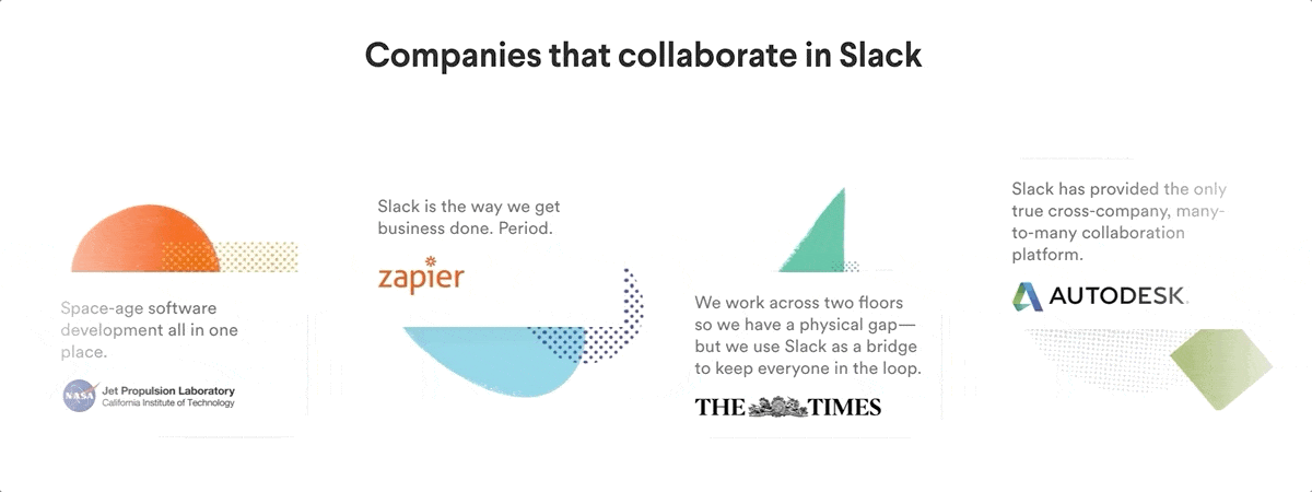
The thing is, it doesn’t take a lot of design skills to create a similar effect in WordPress. Just a few plugins. But it is a unique way of featuring customers quotes if you are looking for something fancy to include on your site.
Home Chef
Home Chef, not to be confused with our earlier entry, is another meal-kit subscription service. They also do a lot of things right on their site, but they use videos to highlight customer reviews rather than a handful of blurbs.

The reason this works for a service like Home Chef is that gourmet food is very… human thing.
Aside from maybe Ratatouille, mammals don’t really worry about taste and presentation. So when it comes to paying a monthly fee for gourmet food, you should really hear about it from other humans.
They also get a bonus point for taking advantage of video marketing, seeing as how videos are the new big thing.
Paul Jarvis
Paul Jarvis is a bit of an outlier, but we’re including his site design here anyway. He’s a designer and podcaster who offers free online courses on a variety of subjects, as well as a subscription-based newsletter called “Sunday Dispatches.”
The best part of his newsletter landing page is that his headline is a testimonial.

It’s simple, but oh boy does it make you want to sign up for his newsletter. While it might not work in every case, it’s a great example of the power of customer reviews. They really can make or break your sales, and this is a clever way to capitalize on them.
The Designer’s Takeaway
Showcase your testimonials. And, if possible, showcase them creatively.
Best of FAQ Page Design
Look, you need to explain how your subscription or membership service works. That’s a must. And if you’re going to do it, you need to design it in such a way that it’s clear and effective. Makes sense? Right.
Here are a few creative brands out there that have success with their FAQ or “How It Works” pages.
Trunk Club
Trunk Club is all about exclusivity, or the feeling that you’re part of something exclusive, anyway. But what they don’t do is equate exclusivity with mystery (in a good way). They’re here to answer your questions about their brand, and they want you to know it.
Enter: The FAQ page.

Well, more like FAQ forum. They have a search bar, they have dropdown menus with their most frequently asked questions, they have categories, they have links… they have everything.
If you have a question about how Trunk Club works, what’s going on with your order, or what you should do if something goes wrong, they’ll have an answer for you. This is peak customer service.
You don’t have to submit a ticket and wait around for an answer, you can do the research yourself. If that doesn’t appeal to the consumer, we’re not sure what does.
DocuSign
Docusign is another example of bountiful explainers done well, but instead of using a forum they simply list their FAQs on every product page. If you’re not sure what eSignatures are all about, just scroll down a little.

This is another example of minimalism in action. The way they design their FAQs puts you at ease without a lot of digging.
It’s another approach that might work for those who have curious customers that won’t necessarily click around a forum for 20 minutes.
FabFitFun
FabFitFun, a subscription box for health and wellness goodies, take yet another approach to their FAQs — they put them at the top of their homepage and the bottom of their product pages.
It’s a small section that explains how the subscription works. Simple. Clean. Easy to read.

At the end of the day, you do need something that explains how your subscription service works, especially if it’s something that will change every month, like a product box.
If you’re of the KISS mentality — Keep It Simple, Stupid — then this is the best way to design your FAQs.
The Designer’s Takeaway.
Always explain your service. For complex questions, over explain. Use a forum. For something relatively straightforward, don’t overthink it. But either way, make sure there’s something on your site that explains how it works and gives customers the chance to ask questions.
Best of Instagram Design
Social media isn’t just for social media platforms. Pairing your Instagram, Pinterest or Twitter pages with your website design is becoming more common these days, and for brands that have a lot of products to show it can be advantageous to do so.
Here are some of the ways you can design your site to feature images from social media.
KitNipBox
KitNipBox is everything you want if you have four paws and predisposition for catching mice. While the end users aren’t humans, humans who love their pets are the ones paying for it, so they want to know what they’re paying for.
So what do you get on the homepage? Pics of toys. Pics of cats loving their toys. Pics from Instagram.

KitNipBox’s Instagram is a cat-lovers dream, and they can prove it with photographic evidence. (If those furry faces aren’t enough to sell you on the box, they also have a handy guide that gives you an example of what you get in a typical shipment.)

But the real selling point is their use of Instagram to sell their product. Because let’s be honest, a cute animal’s face can sell better than any words written by humans ever could. And KitNipBox knows it.

ClassPass
In lieu of having an adorable quadruped sell your products for you, what else is there? Showing your product in action. For fitness subscription service ClassPass, that’s people being fit.
After their header (which also features images of people doing fitnessy things) and CTA, they predominantly feature their Instagram.


If you’re a fitness lover, these posts will speak to you. They’re mesmerizing to look at, they radiate health and wellbeing, and they sell an experience.
Social media is all about selling an experience, and so is ClassPass.
Crowdfire
But what if you’re a SaaS subscription business or you just don’t have enough fit people or fluffy animals around to create an Instagram account? Follow Crowdfire’s lead.
Crowdfire is a social media management app. It’s tough to market on social media, much less about social media. So they use their Instagram in a different way.


They post beautiful images of things that aren’t really related to their product directly, but that do well on social media. Inspirational quotes, pictures of palm trees and happy people…
B2B and SaaS brands take note.
They’re the perfect example of using Instagram effectively even when you don’t have anything tangible to sell.
Honorable Mentions: Buffer + Ritual
Buffer is another great example of the “we don’t sell anything but our Instagram is fire” approach. If you don’t have a tangible product, don’t worry. You can still nail the whole Instagram design aesthetic. You just have to get creative.

Ritual does have a physical product to sell, but their product doesn’t change all that much, unlike KitNipBox or other box-of-the-month businesses. They’re here because they’ve mastered the art of taking pictures of the same product in unique and interesting ways.

The Designer’s Takeaway
Use Instagram. Incorporate it into your website’s design. Customers are becoming social-media savvy, even the older generations, so make sure you’re in on those trends. Plus it’s an easy way to add eye-popping design to your site in a way that also sells product. What’s to hate?
Best of Overall Branding
A lot of the sites on this list could fit into this category because they really nail their site branding, like Dollar Shave Club, MailChimp, and CopyBlogger. But the following examples really are next level.
EmailOctopus
EmailOctopus is pure fun. Look at that octopus. He’s friendly and wants to help you with your emails. How nice!

What really makes this site stand out is its commitment to the fun. Check out their About page:

There are little bubbles around the images they use for their stats. Everything feels like you’re underwater, in a whimsical way. But all the other components are there — strong CTAs, good clarification, and storytelling.
Here’s their pricing page:

Look at those names. Just look at them.
If you have a clever approach to your brand or logo, leverage it. Don’t shy away from being different.
With that being said, the rest of their site is fairly cookie-cutter in the way it displays information, so think about that when you design. Use a template, go with what works, but don’t be afraid to make it your own.
Penji
Penji is a subscription website design service, so you would expect them to have a well-designed website, and they do.
Purple is a bold color. An entire website full of purple might not work. But Penji uses colors to highlight and segment their information in a very clever way.

Your eye is drawn to whatever’s next on the page as you scroll. You’re going to make it to the bottom of the page, even if it’s infinite scroll (it’s not) just because you’re curious about what’s next. That’s the power of branding.
Here’s a look at their About page:

Bold, beautiful colors mixed with storytelling. It feels like you’re reading a book.
Here’s their pricing page:

Great use of graphics, color, and organization. The whole site has aspects of color blocking and perfect graphics placement. It’s brilliantly done, and designers should take note.
Brother’s Coffee
Our final example, Brother’s Coffee, isn’t as flashy as the previous ones. It definitely has a WordPress vibe to it, but in this case, it’s not a bad thing because of how they do it.

It’s simplistic without being simple. Good use of fonts, colors, and layout. No long scrolling or pages of information. A single page full of good design. And good coffee, presumably.
This goes to show that good design is about structure and using elements like color and fonts in an intentional way. Here’s their About page:

And their pricing page:

This site contains almost every single positive element on this list, without being ostentatious. For every designer out there that doesn’t feel “designer” enough, this proves the point that good design doesn’t look like any one thing.
The Designer’s Takeaway
Branding is a key component to website design. The more consistent you can be with your branding, the better your site will look. And you don’t need to have the biggest, most expensive site out there to create something great. Even if you start with a template, you can use your branding to make something truly unique. That’s the goal.
Final Thoughts
Designing a website can be complicated. We get that. If you’re not sure where to start, look to others in your industry who are doing it well and take careful notes of how they’re being successful (DON’T just copy and paste their design or branding).
Are they using Instagram to highlight their products? Do they have a thought-provoking About Us page? Or are they just really good at using strong CTAs? Find out what ideas might work for you and then start small.
Remember that a well designed cookie-cutter site will still sell products, and a beautiful customized site will do the same.