A critical piece to any digital membership experience is your member dashboard.
At member(dev) we’ve built a lot of dashboards with unique features and user experiences. We’ve learned a lot about what works and what doesn’t. Here’s an overview of some membership dashboard design best practices.
First, what is a membership dashboard?
Membership dashboards are typically the starting point or “home page” for your membership experience. This is where users land after logging in to their membership. This is also arguably the most important page for any membership website or application.
Common examples:
- Member Dashboard for online learning site
- Member Dashboard for online community site
- Starting point for a media app (i.e. Netflix, Disney+, etc.)
- Starting point for social media app
- Account homepage for online banking
- etc.
Best Practices
Now let’s discuss some design best practices that help with usability and user experience.
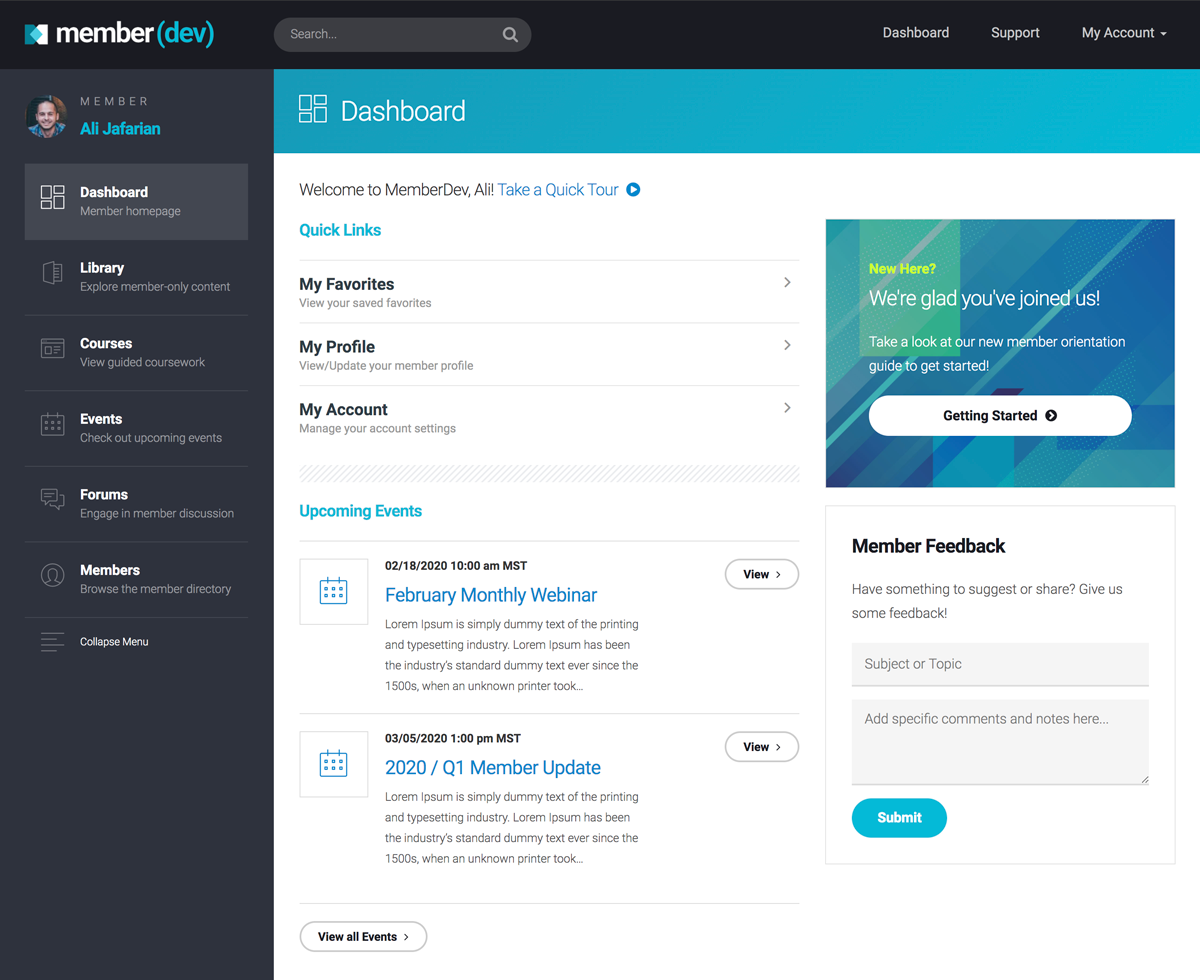
1. Account personalization
One of the simplest and most important design elements is account personalization. This personalizes the experience and helps users identify with their membership. This can also be very subtle in terms of the user experience. It’s essential to include account personalization so your members feel welcome and recognized.
Common examples:
- Welcome greeting with name / photo personalization
- Account dropdown menu
2. Curated content
Curated content gives your dashboard some visual appeal and focus. It’s essential as a means to guide your members to important content, especially early on in their user experience.
Common examples:
- Foundational content
- Guided learning tracks
- Focus content and CTAs (call-to-actions)
3. Key quick links
Another important design element is key quick links. These are links to important areas in the user experience that members should be aware of. By adding these links you save them time and remove potential confusion.
Common examples:
- Start Here links
- Manage Account links
- Explore content links
- Popular links
4. New member onboarding
New member onboarding is a critical design element for any online membership or community. This provides clear direction and instructions for new members. A dedicated area for new member onboarding will boost engagement, retention and help new users feel welcome to your membership. This is a must have element for growing online communities.
Common examples:
- New Here area
- New Member Orientation area
- Getting Started area
5. Community metrics
If you’re membership experience aims to build community, displaying metrics can be a healthy way to support the growth strategy. Showing user activity and contributions will help members feel aligned and recognized with their membership.
Common examples:
- Membership stats
- Referral leaderboards
- Top contributors
6. Latest and Greatest
Another helpful design element is showing the latest and greatest content or activity in your user experience. This gives your members quick access to recently published content without them needing to hunt for it. It also reinforces the value you’re creating every time they log in. As your community grows you can also start to display the most popular content to encourage engagement.
Common examples:
- Latest articles and resources
- Latest member activity
- Latest videos
- Most popular content
7. Easy Access to Help & Support
A final design element is easy access to help and support. This might seem obvious but you’d be surprised how hard some digital experiences make it to find help and support. Give your member a quick and easy way to find help when they need it.
Common examples:
- Prominent Help & Support link
- Member Feedback form
- Chat with Us widget
Here are a few great examples of membership dashboard designs from member(dev) clients.
Piano With Jonny
Online piano membership (Education)

Key Features:
- Personalization
- Quick links
- New here onboarding
- User progress (advanced feature)
- Upcoming events
- Latest content
Front Row Dads
Digital membership experience (Mastermind)

Key Features:
- Event CTA
- Curated content focus
- Community metrics
- User Leaderboard (advanced feature)
- Upcoming events
- Latest content
Backpacking Light
Online backpacking community (Education)

Key Features:
- Personalization
- Latest news / alerts
- Quick links
- Latest member activity
- Latest content
Hopefully that gives you a nice overview of effective membership dashboard designs.
Need some help?
Are you designing or creating a dashboard experience for your online membership? If so, check out our platform to get instant access to great design elements in this article!